Published
- 5 min read
Shinny Button with pure CSS

Shinny Button animation with pure CSS
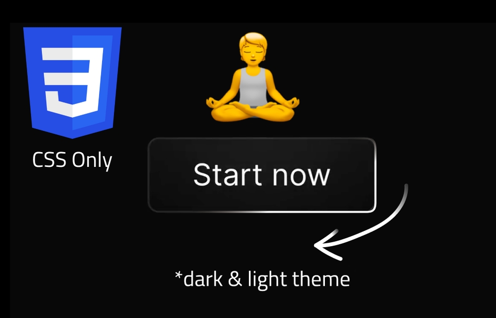
In this article, we will create a shiny button effect using pure CSS. This effect is achieved by using a combination of CSS properties such as gradients, box shadows, and animations. The end result is a button that appears to have a beam of ligth sliding around its edge. This will also be a great opportunity to learn how to animate CSS variables without javascript.
Let’s start by creating a simple button in HTML:
       <a href="" target="_blank" class="mylink radial-gradient">
  <span class="text-span linear-mask fancyanimation">Start now</span>
  <span class="mask-area linear-overlay fancyanimation"></span>
</a>
This is a simple anchor tag with a text span inside it. The text span will be the visible text of the button, and the mask area will be the shiny effect. Let’s declare some CSS to style the button and the page:
       :root {
  --radial-gradient-background: 250, 250, 250;
  --solid-color-background: 15, 15, 15;
  --overlay-color: 255, 255, 255;
  --yin: white;
  --yang: black;
}
body {
  background: var(--yang);
  height: 100vh;
  width: 100vw;
  display: flex;
  flex-direction: column;
  justify-content: center;
  align-items: center;
  transition: background 0.2s linear;
}
This CSS code sets the background color of the page to black and centers the button on the page. Let’s now declare the styles for the button itself:
       .mylink {
  display: inline-flex;
  justify-content: center;
  padding: 1.25rem 0.75rem;
  line-height: 1.5rem;
  font-size: 1rem;
  text-align: center;
  position: relative;
  color: var(--yin);
  border-radius: 0.375rem;
  boder-color: rgb(209 213 219);
  width: 200px;
}

.radial-gradient {
background: radial-gradient(
  circle at 50% 0%,
  rgba(var(--radial-gradient-background), 0.05) 0%,
  transparent 60%
)
rgba(var(--solid-color-background), 1);
}

.mask-area {
  display: block;
  position: absolute;
  inset: 0px;
  border-radius: 0.375rem;
  padding: 1px;
}

.text-span {
  letter-spacing: 0.2rem;
  height: 100%;
  width: 100%;
  display: block;
  position: relative;
}

.linear-mask {
  mask-image: linear-gradient(
    -75deg,
    var(--yin) calc(var(--x) + 20%),
    transparent calc(var(--x) + 30%),
    var(--yin) calc(var(--x) + 100%)
  );
  -webkit-mask-image: linear-gradient(
      -75deg,
      var(--yin) calc(var(--x) + 20%),
      transparent calc(var(--x) + 30%),
      var(--yin) calc(var(--x) + 100%)
  );
}

.linear-overlay {
  background-image: linear-gradient(
      -75deg,
      rgba(var(--overlay-color), 0.1) calc(var(--x) + 20%),
      rgba(var(--overlay-color), 0.5) calc(var(--x) + 25%),
      rgba(var(--overlay-color), 0.1) calc(var(--x) + 100%)
  );
  mask:
      linear-gradient(var(--yang), var(--yang)) content-box,
      linear-gradient(var(--yang), var(--yang));
  -webkit-mask:
      linear-gradient(var(--yang), var(--yang)) content-box,
      linear-gradient(var(--yang), var(--yang));
  mask-composite: exclude;
  -webkit-mask-composite: xor;
}

.fancyanimation {
  animation-name: fancybtn;
  animation-duration: 2.5s;
  animation-iteration-count: infinite;
  animation-timing-function: ease-in-out;
  animation-delay: 2.5s;
}
A lot is happening here, but the most important part is the fancyanimation class.
The animation itself is happening thanks to the .linear-overlay class that has this --x variable that is being animated.
As of now, we haven’t declared the animation itself, so let’s do that now:
@property --x {
  syntax: '<percentage>';
  initial-value: 100%;
  inherits: false;
}

@keyframes fancybtn {
  0% {--x: 100%}
  100% {--x: -100%}
}
The @property rule is used to define css variables that can be anmated to modify the behaviour of css properties.
In this case, we are defining a custom property called --x that will be used to animate the shiny effect on the button.
The @keyframes rule is used to define the animation itself.
In this case, the animation is called fancybtn and it animates the --x variable from 100% to -100% in 2.5s.
This will create a sliding effect on the shiny effect of the button.
The --x property is given a type of <percentage>, an initial value of 100%, and it does not inherit its value from its parent element.
There are other types of custom properties that can be defined in CSS, such as <color>, <length>, and <url>.
Make sure to check if the browser you are using supports the @property rule before using it in your CSS code.
If not, you can use a fallback method to achieve the same effect.
       window.CSS.registerProperty({
  name: "--x",
  syntax: "<percentage>",
  inherits: false,
  initialValue: -100%,
});
Let’s now add support for dark and light mode to our button: We need a button trigger the change of the background color of the page.
       <div style="margin-top: 100px;">
  <button id="themetoggle" class="mylink radial-gradient  transform active:scale-90 transition-transform">
  <span class="text-span linear-mask fancyanimation">Dark / Light</span>
  <span class="mask-area linear-overlay fancyanimation"></span>
</button>
</div>
When the button is clicked, we will toggle the background color of the page between black and white. To do so, we need to reverse the css color variables we declared at the beginning of the CSS file.
       body.dark {
  --yin: black;
  --yang: white;
  --overlay-color: 0, 0, 0;
  --solid-color-background: 250, 250, 250;
  --radial-gradient-background: 31, 41, 55;
}
We also need to add some JavaScript to handle the click event on the button and toggle the dark mode class on the body
       document.getElementById('themetoggle').addEventListener('click', () => {
  document.body.classList.toggle('dark');
});
And there you have it! A shiny button effect created using pure CSS. You can experiment with different colors, animations, and effects to create your own unique button styles. This tutorial is available on Codepen, and I have alos made a video on my YouTube channel showing how to create this effect step by step. I hope you enjoyed this tutorial and found it helpful. This video was inspired by a tutorial from a channel called “rithmic” that you can watch here. This video explains in deeper details the underlaying of css animation. Happy coding!